Zarna Water Technology
Work Overview
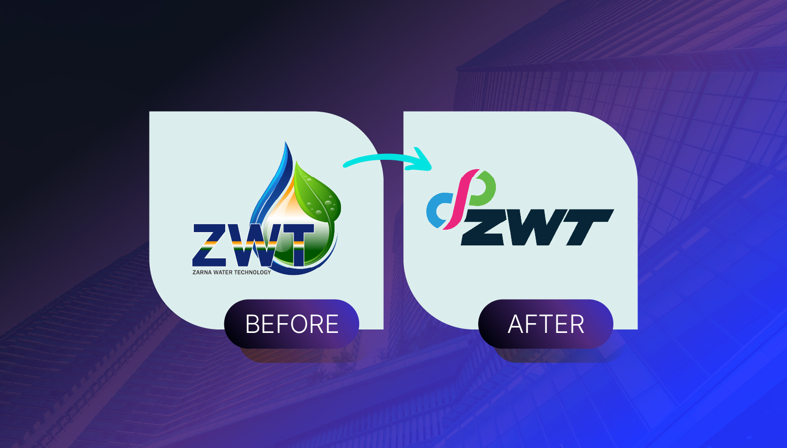
Zarna Water Technology (ZWT) is a leading Indian company specializing in water purification systems and annual maintenance services. When they approached us, their brand identity was limited to a generic water drop logo, common within the industry and lacking a distinct personality.
Our goal was to give ZWT a modern, memorable identity that embodies their core values of purity, reliability, and timeless service.
The Challenge
The existing logo didn’t convey the brand’s depth or its long-term commitment to customers.
ZWT wanted a visual identity that:
- Represents timelessness and trust
- Reflects the purity and flow of water
- Feels modern, professional, and scalable across all platforms
- Sets the foundation for consistent branding across digital and print media
The Concept
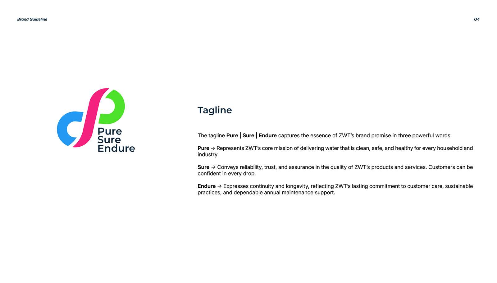
During our strategy phase, we explored symbols that could communicate both continuity and purity. The infinity symbol stood out as the perfect representation — timeless, fluid, and universally trusted.
Interestingly, when viewed closely, the infinity loop appears like two water drops merging together, symbolizing ZWT’s mission of uniting technology and trust to deliver lasting purity.
The Solution
We developed a modern, timeless logo centered around the infinity concept, refined with smooth curves and balanced proportions. The refreshed design embodies flow and harmony, qualities essential to ZWT’s brand promise.
Interestingly, when viewed closely, the infinity loop appears like two water drops merging together, symbolizing ZWT’s mission of uniting technology and trust to deliver lasting purity.
Beyond the logo, we built a comprehensive brand identity system, including:
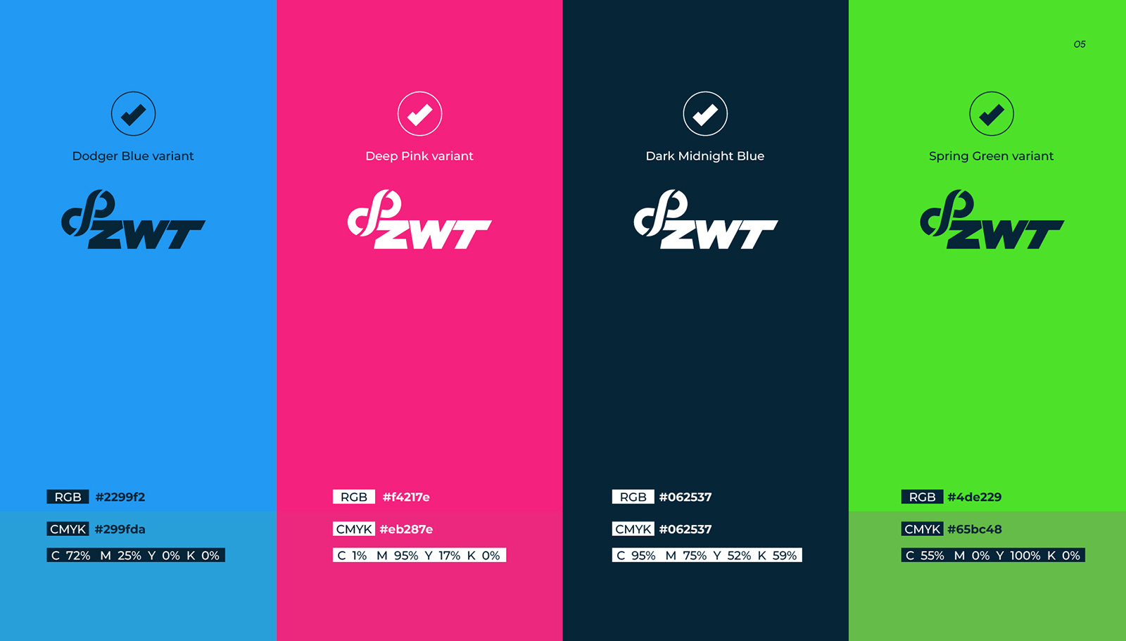
Color Palette – calm blues and neutrals that evoke trust and purity
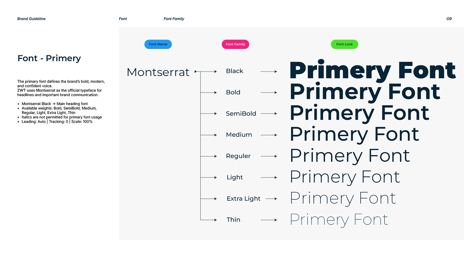
Typography – clean sans-serif fonts that convey modernity and clarity
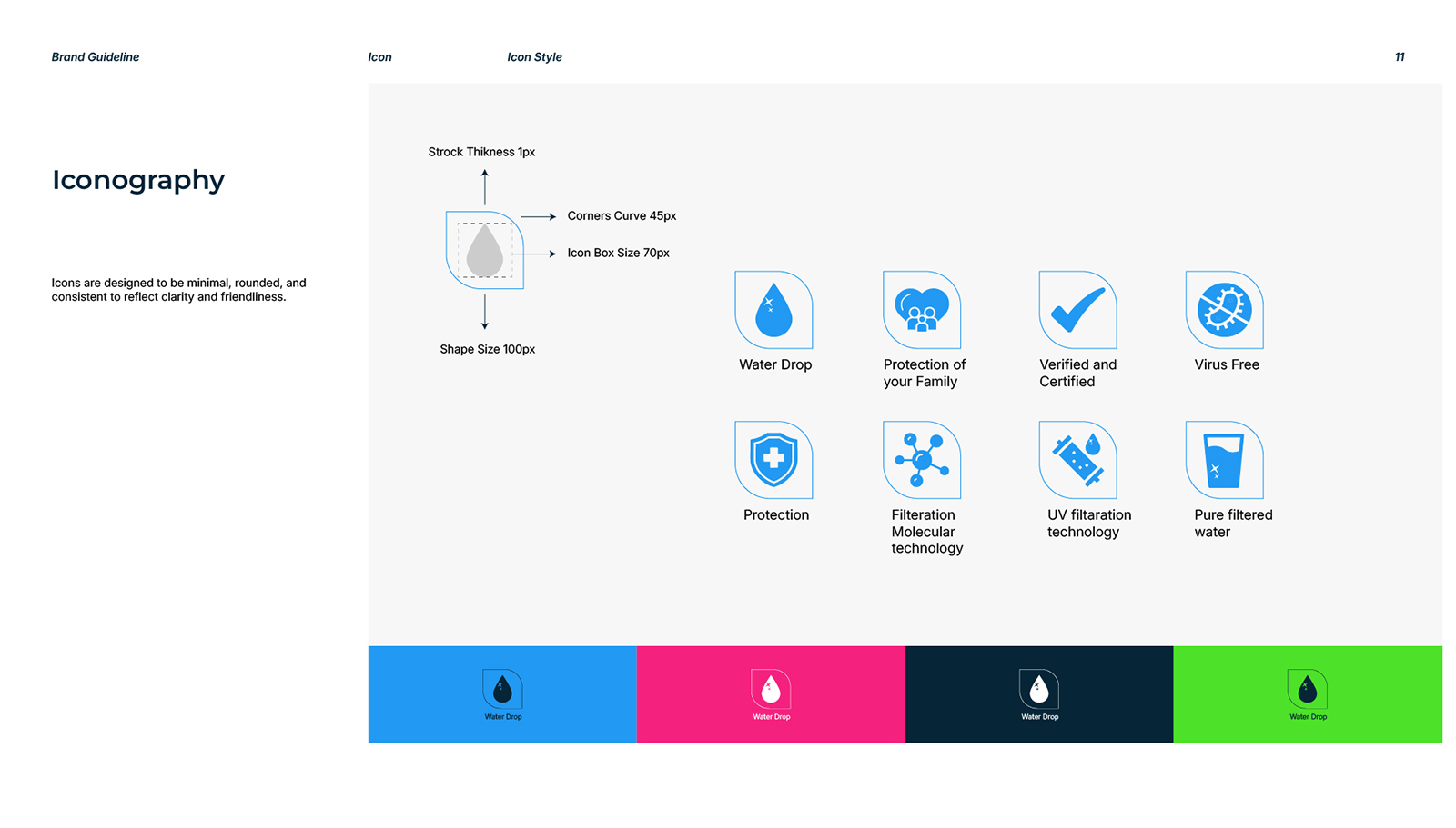
Iconography System – minimalist icons to maintain brand consistency
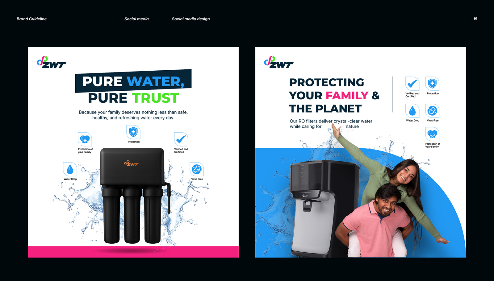
Social Media Templates – visual direction for digital communication
Brand Guidelines Document – ensuring cohesive use of all brand assets
The Impact
The new identity helped ZWT move from a generic look to a refined, recognizable brand. It now stands as a symbol of reliability and timeless service — aligning perfectly with their values and long-term vision.
The rebranding not only enhanced their visual appeal but also instilled greater confidence among customers and partners.
Ovi Cards
Work Overview
Ovi Cards is a Mumbai-based platform that enables professionals and businesses to create smart, digital business cards that simplify networking in a connected world. When the founders approached us, the brand was at an early stage, they had the product idea and technology ready but no visual identity to represent it.
Our goal was to craft a modern, scalable, and tech-forward brand identity from the ground up, one that would build trust, stand out in the digital space, and visually communicate Ovi Cards’ vision of effortless connectivity.
The Challenge
As a new entrant in a fast-evolving digital segment, Ovi Cards needed a brand that would:
- Establish credibility and professionalism among corporate and creative users
- Reflect technology, simplicity, and innovation in its visuals
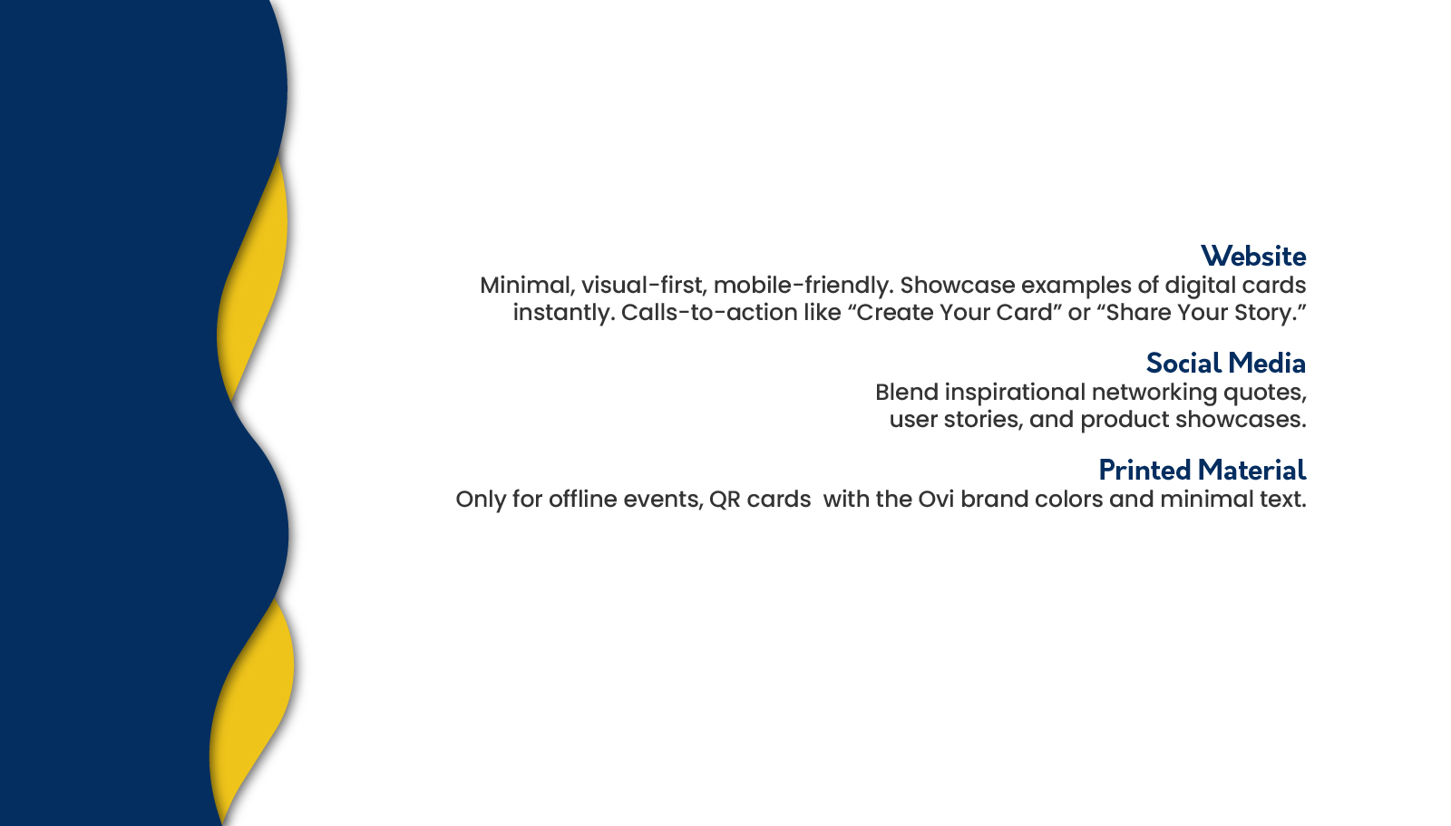
- Remain adaptable across both digital and print touchpoints
- Create a consistent and memorable identity system from day one
The Concept
We began by understanding the brand’s purpose, to make professional connections effortless and eco-friendly. The name “Ovi” inspired a design philosophy rooted in simplicity, flow, and connection.
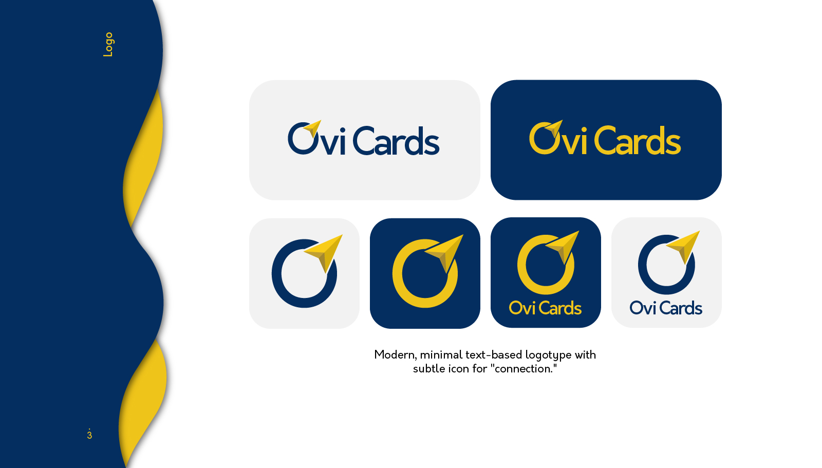
The logo concept draws from the idea of digital sharing, symbolizing seamless data sharing. Its clean geometric structure and subtle motion-inspired elements reflect modern tech aesthetics while retaining warmth and approachability.
The Solution
We created a comprehensive visual identity system that defined Ovi Cards’ presence across all mediums.
Our deliverables included:
Logo Design - futuristic yet simple, symbolizing connection and innovation
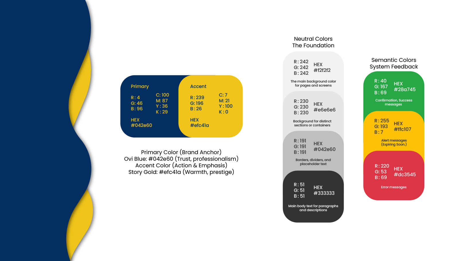
Color Palette - a blend of fresh digital hues with reliable neutrals for balance
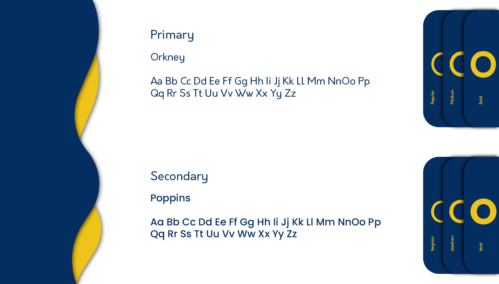
Typography System - sleek sans-serif fonts to convey clarity and modernity
Brand Guidelines - defining logo usage, spacing, color, and tone of voice
The Impact
The new identity gave Ovi Cards a strong and credible foundation to launch with confidence. The visuals now reflect their core promise, making professional networking smart, sustainable, and seamless.
The brand design successfully positioned Ovi Cards as a forward-thinking tech platform ready to connect the modern world, one digital card at a time.


